Friday 22 May 2015

ATA Trucking Index decreased 3% in April

Here is an indicator that I follow on trucking, from the ATA: ATA Truck Tonnage Index Fell 3% in April
American Trucking Associations’ advanced seasonally adjusted For-Hire Truck Tonnage Index fell 3% in April, following a revised gain of 0.4% during the previous month. In April, the index equaled 128.6 (2000=100), which was the lowest level since April 2014. The all-time high is 135.8, reached in January 2015.

Compared with April 2014, the SA index increased just 1%, which was well below the 4.2% gain in March and the smallest year-over-year gain since February 2013. ...

“Like most economic indicators, truck tonnage was soft in April,” said ATA Chief Economist Bob Costello. “Unless tonnage snaps back in May and June, GDP growth will likely be suppressed in the second quarter.”

Costello added that truck tonnage is off 5.3% from the high in January.

“The next couple of months will be telling for both truck freight and the broader economy. Any significant jump from the first quarter is looking more doubtful,” he said.

Trucking serves as a barometer of the U.S. economy, representing 68.8% of tonnage carried by all modes of domestic freight transportation, including manufactured and retail goods. Trucks hauled just under 10 billion tons of freight in 2014. Motor carriers collected $700.4 billion, or 80.3% of total revenue earned by all transport modes.
emphasis added
ATA Trucking Click on graph for larger image.

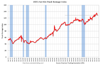
Here is a long term graph that shows ATA's For-Hire Truck Tonnage index.

The dashed line is the current level of the index.

The index is now up only 1.0% year-over-year.
Yellen: Expect Rate Hike in 2015, Several Years before Fed Funds Rate "back to normal" level

From Fed Chair Janet Yellen: The Outlook for the Economy
[I]f the economy continues to improve as I expect, I think it will be appropriate at some point this year to take the initial step to raise the federal funds rate target and begin the process of normalizing monetary policy. To support taking this step, however, I will need to see continued improvement in labor market conditions, and I will need to be reasonably confident that inflation will move back to 2 percent over the medium term.

After we begin raising the federal funds rate, I anticipate that the pace of normalization is likely to be gradual. The various headwinds that are still restraining the economy, as I said, will likely take some time to fully abate, and the pace of that improvement is highly uncertain. If conditions develop as my colleagues and I expect, then the FOMC's objectives of maximum employment and price stability would best be achieved by proceeding cautiously, which I expect would mean that it will be several years before the federal funds rate would be back to its normal, longer-run level.

Having said that, I should stress that the actual course of policy will be determined by incoming data and what that reveals about the economy. We have no intention of embarking on a preset course of increases in the federal funds rate after the initial increase. Rather, we will adjust monetary policy in response to developments in economic activity and inflation as they occur. If conditions improve more rapidly than expected, it may be appropriate to raise interest rates more quickly; conversely, the pace of normalization may be slower if conditions turn out to be less favorable.
emphasis added

Key Measures Show Low Inflation in April

The Cleveland Fed released the median CPI and the trimmed-mean CPI this morning:
According to the Federal Reserve Bank of Cleveland, the median Consumer Price Index rose 0.2% (2.2% annualized rate) in April. The 16% trimmed-mean Consumer Price Index also rose 0.2% (2.2% annualized rate) during the month. The median CPI and 16% trimmed-mean CPI are measures of core inflation calculated by the Federal Reserve Bank of Cleveland based on data released in the Bureau of Labor Statistics’ (BLS) monthly CPI report.

Earlier today, the BLS reported that the seasonally adjusted CPI for all urban consumers rose 0.1% (1.2% annualized rate) in April. The CPI less food and energy rose 0.3% (3.1% annualized rate) on a seasonally adjusted basis.
Note: The Cleveland Fed has the median CPI details for April here.

Inflation Measures Click on graph for larger image.

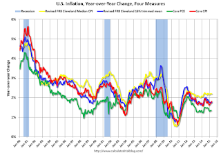
This graph shows the year-over-year change for these four key measures of inflation. On a year-over-year basis, the median CPI rose 2.2%, the trimmed-mean CPI rose 1.7%, and the CPI less food and energy rose 1.8%. Core PCE is for March and increased 1.35% year-over-year.

On a monthly basis, median CPI was at 2.2% annualized, trimmed-mean CPI was at 2.2% annualized, and core CPI was at 3.1% annualized.

On a year-over-year basis these measures suggest inflation remains below the Fed's target of 2% (median CPI is slightly above 2%).

The key question for the Fed is if these key measures will move back towards 2%.

BLS: CPI increased 0.1% in April, Core CPI increased 0.3%

From the BLS:
The Consumer Price Index for All Urban Consumers (CPI-U) increased 0.1 percent in April on a seasonally adjusted basis, the U.S. Bureau of Labor Statistics reported today. Over the last 12 months, the all items index declined 0.2 percent before seasonal adjustment.

The index for all items less food and energy rose 0.3 percent in April and led to the slight increase in the seasonally adjusted all items index.
emphasis added
I'll post a graph later today after the Cleveland Fed releases the median and trimmed-mean CPI. This was at the consensus forecast of a 0.1% increase for CPI, and above the forecast of a 0.1% increase in core CPI.

Black Knight: Mortgage Delinquencies increased slightly in April

According to Black Knight's First Look report for April, the percent of loans delinquent increased 1% in April compared to March, and declined 15% year-over-year.

The percent of loans in the foreclosure process declined 2% in March and were down 25% over the last year.

Black Knight reported the U.S. mortgage delinquency rate (loans 30 or more days past due, but not in foreclosure) was 4.77% in April, up from 4.70% in March.

The percent of loans in the foreclosure process declined in April to 1.51%.  This was the lowest level of foreclosure inventory since January 2008.

The number of delinquent properties, but not in foreclosure, is down 406,000 properties year-over-year, and the number of properties in the foreclosure process is down 252,000 properties year-over-year.

Black Knight will release the complete mortgage monitor for April in early June.

Black Knight: Percent Loans Delinquent and in Foreclosure Process
  Apr
2015
Mar
2015
Apr
2014
Apr
2013
Delinquent4.77%4.70%5.62%6.21%
In Foreclosure1.51%1.55%2.02%3.17%
Number of properties:
Number of properties that are 30 or more, and less than 90 days past due, but not in foreclosure:1,463,0001,409,0001,634,0001,717,000
Number of properties that are 90 or more days delinquent, but not in foreclosure:952,000971,0001,187,0001,394,000
Number of properties in foreclosure pre-sale inventory:764,000782,0001,016,0001,588,000
Total Properties3,179,0003,162,0003,837,0004,699,000

Thursday 21 May 2015

Friday: CPI, Yellen

Earlier from the Philly Fed: May Manufacturing Survey
Manufacturing activity in the region increased modestly in May, according to firms responding to this month’s Manufacturing Business Outlook Survey. Indicators for general activity, new orders, and shipments were positive but remain at low readings. Employment increased at the reporting firms, but the employment index moderated compared with April. Firms reported continued price reductions in May, with indicators for prices of inputs and the firms’ own products remaining negative. The survey’s indicators of future activity suggest that firms expect continuing growth in the manufacturing sector over the next six months.
...
The survey’s broadest measure of manufacturing conditions, the diffusion index of current activity, decreased from 7.5 in April to 6.7 in May. ...

Firms’ responses suggest some weakening in labor market conditions this month compared with April. ... The current employment index, however, fell 5 points, to 6.7.
emphasis added
This was below the consensus forecast of a reading of 8.0 for May.

Also the Kansas City Fed reported: Tenth District Manufacturing Activity Declined More Sharply
“Factories in our region saw an even sharper decline in May than in March or April, as exports fell further and energy-related producers saw another drop in orders,” said [Chad Wilkerson, vice president and economist at the Federal Reserve Bank of Kansas City] “However, firms’ overall still plan a modest increase in employment over the next six to twelve months.”
...
Tenth District manufacturing activity declined more sharply in May than in previous months and producers’ expectations also fell, with both reaching their lowest levels since mid-2009. ... The month-over-month composite index was -13 in May, down from -7 in April and -4 in March ... Production fell most sharply in energy-producing states like Oklahoma and New Mexico, but it was also down in most other District states.
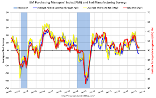
ISM PMI Click on graph for larger image.

Here is a graph comparing the regional Fed surveys and the ISM manufacturing index. The yellow line is an average of the NY Fed (Empire State) and Philly Fed surveys through May. The ISM and total Fed surveys are through April.

The average of the Empire State and Philly Fed surveys increased slightly in May, and this suggests a another weak ISM report for May.

Friday:
• At 8:30 AM ET, the Consumer Price Index for April from the BLS. The consensus is for a 0.1% increase in prices, and a 0.1% increase in core CPI.

• At 1:00 PM, Speech by Fed Chair Janet L. Yellen, U.S. Economic Outlook, At the Greater Providence Chamber of Commerce Economic Outlook Luncheon, Providence, Rhode Island

Lawler: Updated Table of Distressed Sales and Cash buyers for Selected Cities in April

Economist Tom Lawler sent me the updated table below of short sales, foreclosures and cash buyers for several selected cities in April.

On distressed: Total "distressed" share is down in most of these markets mostly due to a decline in short sales (Mid-Atlantic is up year-over-year because of an increase in foreclosures in Baltimore).

Short sales are down in these areas.

The All Cash Share (last two columns) is declining year-over-year. As investors pull back, the share of all cash buyers has been declining.

  Short Sales ShareForeclosure Sales Share Total "Distressed" ShareAll Cash Share
Apr-15Apr-14Apr-15Apr-14Apr-15Apr-14Apr-15Apr-14
Las Vegas7.2%12.4%8.3%11.4%15.5%23.8%30.4%41.4%
Reno**6.0%15.0%5.0%6.0%11.0%21.0%   
Phoenix2.5%4.0%3.8%6.5%6.3%10.5%25.3%32.2%
Sacramento5.6%9.5%6.6%7.5%12.2%17.0%18.4%21.9%
Minneapolis2.9%5.1%9.2%16.0%12.0%21.1%   
Mid-Atlantic4.5%5.9%12.9%10.0%17.3%15.9%17.2%19.5%
Orlando4.8%9.1%24.7%23.7%29.5%32.8%37.4%42.4%
Florida SF4.0%6.9%19.1%21.1%23.1%28.0%37.2%43.4%
Florida C/TH2.0%4.5%14.6%15.6%16.6%20.1%65.4%70.9%
Miami MSA SF6.2%10.5%18.4%16.5%24.7%27.0%37.8%44.4%
Miami MSA C/TH2.3%5.5%18.2%17.5%20.6%23.0%68.9%73.4%
Tampa MSA SF4.5%7.0%20.3%23.2%24.8%30.1%34.5%41.6%
Tampa MSA C/TH2.9%4.6%15.5%18.8%18.4%23.3%60.8%66.7%
So. California*4.4%5.0%4.5%5.2%8.9%10.2%   
Chicago (city)        20.3%27.3%   
Hampton Roads        22.2%24.4%   
Northeast Florida        28.9%38.0%   
Hampton Roads        22.2%24.4%   
Tucson            27.1%30.5%
Toledo            30.2%33.4%
Wichita            19.8%25.1%
Des Moines            13.8%17.1%
Peoria            17.3%21.2%
Georgia***            21.6%34.3%
Omaha            16.4%22.3%
Pensacola            32.3%35.6%
Knoxville            23.1%25.3%
Richmond VA MSA    11.5%15.4%    18.2%22.5%
Memphis    16.1%17.3%       
Springfield IL**    10.3%13.2%    17.9%N/A
*share of existing home sales, based on property records
**Single Family Only
***GAMLS

Lawler: Existing Home Sales Dipped in April; Sales in South Seem Low

From housing economist Tom Lawler:

The National Association of Realtors reported that US existing home sales ran at an estimated seasonally adjusted annual rate of 5.04 million in April, down 3.3% from March’s upwardly-revised pace and up 6.1% from last March’s seasonally adjusted pace. The NAR’s estimate was below both my projection based on regional tracking and the “consensus” forecast. Relative to March, April sales (seasonally adjusted) were up 1.7% in the Midwest, but down 1.7% in the West, down 3.3% in the Northeast, and down a sizable 6.8% in the South.

In terms of my tracking, my “miss” was almost entirely in the South. According to the NAR’s estimates, existing home sales in the South last month (not seasonally adjusted) were up just 2.9% from last April, which seems way too low based on realtor/MLS reports from the South. For example, MLS-based reports show that home sales registered double-digit YOY gains in the broad Mid-Atlantic region (mainly most of Maryland, DC and Northern Virginia), Florida, Georgia, South Carolina, Alabama, and much of Kentucky and Arkansas (my coverage in those states is limited). MLS-based reports in most other states suggest YOY sales gains in the 5% (e.g., Texas) to 9% (e.g., North Carolina) range. To be sure, some areas in the region saw YOY declines in sales (e.g., Oklahoma at -2%, and Jackson, Mississippi at -13%). But for the region as a whole, local realtor/MLS reports would have suggested YOY sales growth for the region as a whole well above 2.9%.

Often when my projection for the NAR sales number is off, it turns out that realtor/MLS reports released subsequent to my projection (e.g., today) show significantly different sales numbers than I had had been assuming. That was not the case this month. Based on local realtor/MLS reports released through today (which included quite a few, including Florida and Texas), the NAR’s estimate for existing home sales in the South for April look way too low. The NAR’s estimates for the other regions, in contrast, look reasonable.

The NAR also reported that its preliminary estimate of the number of existing homes for sale at the end of April was 2.21 million, down 10.0% from March’s upwardly-revised (to 2.10 million from 2.00 million) level, and down 0.9% from last April’s level. This inventory number was just slightly below my projection.

Finally, the NAR estimated that the median existing SF home sales price in April, $221,200, up 10.0% from last April, and well above my projection based on regional tracking. The YOY % change in the median existing SF home sales price for March was revised downward to 7.9% from 8.7%.

A Few Comments on April Existing Home Sales

Inventory is still very low (and down 0.9% year-over-year in April). More inventory would probably mean smaller price increases and slightly higher sales, and less inventory means lower sales and somewhat larger price increases. This will be important to watch over the next few months during the Spring buying season.

Also, the NAR reported total sales were up 6.1% from April 2014, however normal equity sales were up even more, and distressed sales down sharply.  From the NAR (from a survey that is far from perfect):
Distressed sales — foreclosures and short sales — were 10 percent of sales in April, unchanged from March and below the 15 percent share a year ago. Seven percent of April sales were foreclosures and 3 percent were short sales.
Last year in April the NAR reported that 15% of sales were distressed sales.

A rough estimate: Sales in April 2014 were reported at 4.75 million SAAR with 15% distressed.  That gives 712 thousand distressed (annual rate), and 4.04 million equity / non-distressed.  In April 2015, sales were 5.04 million SAAR, with 10% distressed.  That gives 504 thousand distressed - a decline of about 29% from April 2014 - and 4.54 million equity.  Although this survey isn't perfect, this suggests distressed sales were down sharply - and normal sales up around 12%.

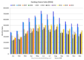
The following graph shows existing home sales Not Seasonally Adjusted (NSA).

Existing Home Sales NSAClick on graph for larger image.

Sales NSA in April (red column) were just below April 2013 (NSA).

Earlier:
Existing Home Sales in April: 5.04 million SAAR, Inventory down 0.9% Year-over-year

Existing Home Sales in April: 5.04 million SAAR, Inventory down 0.9% Year-over-year

The NAR reports: Existing-Home Sales Lose Momentum in April
Total existing–home sales, which are completed transactions that include single–family homes, townhomes, condominiums and co–ops, declined 3.3 percent to a seasonally adjusted annual rate of 5.04 million in April from an upwardly revised 5.21 million in March. Despite the monthly decline, sales have increased year–over–year for seven consecutive months and are still 6.1 percent above a year ago. ...

Total housing inventory at the end of April increased 10.0 percent to 2.21 million existing homes available for sale, but is still 0.9 percent below a year ago (2.23 million). Unsold inventory is at a 5.3–month supply at the current sales pace, up from 4.6 months in March.
Existing Home SalesClick on graph for larger image.

This graph shows existing home sales, on a Seasonally Adjusted Annual Rate (SAAR) basis since 1993.

Sales in April (5.04 million SAAR) were 3.3% lower than last month, and were 6.1% above the April 2014 rate.

The second graph shows nationwide inventory for existing homes.

Existing Home InventoryAccording to the NAR, inventory increased to 2.21 million in April from 2.01 million in March.   Headline inventory is not seasonally adjusted, and inventory usually decreases to the seasonal lows in December and January, and peaks in mid-to-late summer.

The third graph shows the year-over-year (YoY) change in reported existing home inventory and months-of-supply. Since inventory is not seasonally adjusted, it really helps to look at the YoY change. Note: Months-of-supply is based on the seasonally adjusted sales and not seasonally adjusted inventory.

Year-over-year Inventory Inventory decreased 0.9% year-over-year in April compared to April 2014.  

Months of supply was at 5.3 months in April.

This was below expectations of sales of 5.20 million.  For existing home sales, a key number is inventory - and inventory is still low.    I'll have more later ...

Weekly Initial Unemployment Claims increased to 274,000, Lowest 4-Week average in 15 years

The DOL reported:
In the week ending May 16, the advance figure for seasonally adjusted initial claims was 274,000, an increase of 10,000 from the previous week's unrevised level of 264,000. The 4-week moving average was 266,250, a decrease of 5,500 from the previous week's unrevised average of 271,750. This is the lowest level for this average since April 15, 2000 when it was 266,250.

There were no special factors impacting this week's initial claims.
The previous week was unrevised.

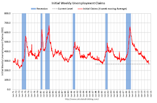
The following graph shows the 4-week moving average of weekly claims since 1971.

Click on graph for larger image.


The dashed line on the graph is the current 4-week average. The four-week average of weekly unemployment claims decreased to 266,250.

This was above the consensus forecast of 270,000, and the low level of the 4-week average suggests few layoffs. This is the lowest 4-week average in 15 years (since April 2000).

Note: If the 4-week average falls to 266,000, it will be the lowest in 40 years!

Wednesday 20 May 2015

Thursday: Existing Home Sales, Unemployment Claims and More

From Jon Hilsenrath at the WSJ: Fed Looks Past June for First Rate Hike
Federal Reserve officials at their April policy meeting said in the most explicit terms yet that they are unlikely to start raising short-term interest rates in June, as seemed possible when 2015 began.

Officials have been saying they won’t begin lifting their benchmark federal funds rate from near zero until they see more improvement in the labor market and are confident inflation will rise toward their 2% target. Several of them started the year thinking they might reach that point by midyear.

But by last month, after watching the economy stumble through the winter, many at the April 28-29 meeting were doubtful those criteria for a rate increase would be met, according to minutes of the meeting released Wednesday.
Thursday:
• At 8:30 AM ET, the initial weekly unemployment claims report will be released. The consensus is for claims to increase to 270 thousand from 264 thousand.

• Also at 8:30 AM, the Chicago Fed National Activity Index for April. This is a composite index of other data.

• At 10:00 AM, the Philly Fed manufacturing survey for May. The consensus is for a reading of 8.0, up from 7.5 last month (above zero indicates expansion).

• At 10:00 AM, Existing Home Sales for April from the National Association of Realtors (NAR). The consensus is for sales of 5.22 million on seasonally adjusted annual rate (SAAR) basis. Sales in March were at a 5.19 million SAAR. Economist Tom Lawler estimates the NAR will report sales of 5.20 million SAAR.

• At 11:00 AM, the Kansas City Fed manufacturing survey for May.

• At 1:30 PM, Speech by Fed Vice Chairman Stanley Fischer, Past, Present, and Future Challenges for the Euro Area, At the ECB Forum on Central Banking, Linho Sintra, Portugal

CoreLogic: Southern California April Home Sales up 8.5% Year-over-year

From CoreLogic (formerly DataQuick): CoreLogic Reports Southern California Home Sales Rose 8.5 Percent Year over Year in April 2015
A total of 21,708 new and existing houses and condominiums sold in April 2015 in Los Angeles, Riverside, San Diego, Ventura, San Bernardino and Orange counties, up 9.9 percent month over month from 19,760 sales in March 2015. April 2015 sales also rose by 8.5 percent compared to April 2014 when there were 20,008 sales, marking the second straight month with year-over-year increases. Southern California home sales in April 2015 were the second highest for the month of April since 2006, only behind April 2013 when 21,795 homes sold.

Sales activity picked up last month, making it one of the stronger Aprils since the housing bust, though sales remained below average," said Andrew LePage, a data analyst for CoreLogic. "Many buyers still face credit and affordability hurdles, and the inventory of homes for sale remains relatively tight in many markets. New home construction is still well below historically normal levels, too."
...
Real estate-owned (REO) sales represented 4.5 percent of all Southern California home sales in April, down from 5.1 percent of sales in March 2015 and down from 5.2 percent in April 2014.
...
Short sales accounted for 4.4 percent of total sales in April, up from 4 percent in March 2015 and down from 5 percent in April 2014.
emphasis added
The NAR will release existing home sales for April tomorrow at 10:00 AM ET. The consensus is for sales of 5.22 million on seasonally adjusted annual rate (SAAR) basis, up about 10% from April 2014.

FOMC Minutes: June Rate Hike Unlikely

From the Fed: Minutes of the Federal Open Market Committee, April 28-29, 2015 . Excerpts:
In their discussion of communications regarding the path of the federal funds rate over the medium term, participants expressed a range of views about when economic conditions were likely to warrant an increase in the target range for the federal funds rate. Participants continued to judge that it would be appropriate to raise the target range for the federal funds rate when they had seen further improvement in the labor market and were reasonably confident that inflation would move back to its 2 percent objective over the medium term. Although participants expressed different views about the likely timing and pace of policy firming, they agreed that the Committee's decision to begin firming would appropriately depend on the incoming data and their implications for the economic outlook. A few anticipated that the information that would accrue by the time of the June meeting would likely indicate sufficient improvement in the economic outlook to lead the Committee to judge that its conditions for beginning policy firming had been met. Many participants, however, thought it unlikely that the data available in June would provide sufficient confirmation that the conditions for raising the target range for the federal funds rate had been satisfied, al-though they generally did not rule out this possibility. Participants discussed the merits of providing an explicit indication, in postmeeting statements released prior to the commencement of policy firming, that the target range for the federal funds rate would likely be raised in the near term. However, most participants felt that the timing of the first increase in the target range for the federal funds rate would appropriately be determined on a meeting-by-meeting basis and would depend on the evolution of economic conditions and the outlook. In keeping with this data-dependent approach, some participants further suggested that the postmeeting statement's description of the economic situation and outlook, and of progress toward the Committee's goals, provided the appropriate means by which the Committee could help the public assess the likely timing of the initial increase in the target range for the federal funds rate.
emphasis added

AIA: Architecture Billings Index declined in April

Note: This index is a leading indicator primarily for new Commercial Real Estate (CRE) investment.

From the AIA: Architecture Billings Remain Stuck in Winter Slowdown
Riding a stretch of increasing levels of demand for thirteen out of the last fifteen months, the Architecture Billings Index (ABI) dropped in April for the second month this year. As a leading economic indicator of construction activity, the ABI reflects the approximate nine to twelve month lead time between architecture billings and construction spending. The American Institute of Architects (AIA) reported the April ABI score was 48.8, down sharply from a mark of 51.7 in March. This score reflects a decrease in design services (any score above 50 indicates an increase in billings). The new projects inquiry index was 60.1, up from a reading of 58.2 the previous month.

“The fundamentals in the design and construction industry remain very healthy,” said AIA Chief Economist Kermit Baker, Hon. AIA, PhD. “The fact that both inquires for new projects and new design contracts continued to accelerate at a healthy pace in April points to strong underlying demand for design activity. However, April would typically be a month where these projects would be in full swing, but a severe winter in many parts of the Northeast and Midwest has apparently delayed progress on projects.”
emphasis added
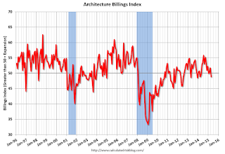
AIA Architecture Billing Index Click on graph for larger image.

This graph shows the Architecture Billings Index since 1996. The index was at 48.8 in April, down from 51.7 in March. Anything below 50 indicates contraction in demand for architects' services.

Note: This includes commercial and industrial facilities like hotels and office buildings, multi-family residential, as well as schools, hospitals and other institutions.  The multi-family residential market was negative for the third consecutive month - and this might be indicating a slowdown for apartments - or at least less growth.

According to the AIA, there is an "approximate nine to twelve month lag time between architecture billings and construction spending" on non-residential construction.  This index was mostly positive over the last year, suggesting an increase in CRE investment in 2015.

MBA: Mortgage Applications Decrease in Latest Weekly Survey

From the MBA: Mortgage Applications Decrease in Latest MBA Weekly Survey
Mortgage applications decreased 1.5 percent from one week earlier, according to data from the Mortgage Bankers Association’s (MBA) Weekly Mortgage Applications Survey for the week ending May 15, 2015. ...

The Refinance Index increased 0.3 percent from the previous week. The seasonally adjusted Purchase Index decreased 4 percent from one week earlier, to the lowest level since April. The unadjusted Purchase Index decreased 4 percent compared with the previous week and was 11 percent higher than the same week one year ago.

“Mortgage rates increased last week, and Treasury rates increased to a recent high at mid week before falling at the end of the week. Overall purchase activity fell for the week, along with conventional refinance volume, but government refinance volume increased. The level of purchase applications remained 11 percent higher than the same week last year, but the drop this week may indicate borrowers being wary of the recent run up in mortgage rates,” said Mike Fratantoni, MBA’s Chief Economist.
...
The average contract interest rate for 30-year fixed-rate mortgages with conforming loan balances ($417,000 or less) increased to 4.04 percent, its highest level since December 2014, from 4.00 percent, with points decreasing to 0.32 from 0.36 (including the origination fee) for 80 percent loan-to-value ratio (LTV) loans.
emphasis added
Mortgage Refinance Index Click on graph for larger image.


The first graph shows the refinance index.

2014 was the lowest year for refinance activity since year 2000.

It would take much lower rates - below 3.5% - to see a significant refinance boom this year.

Mortgage Purchase IndexThe second graph shows the MBA mortgage purchase index.  

According to the MBA, the unadjusted purchase index is 11% higher than a year ago.

Tuesday 19 May 2015

Wednesday: FOMC Minuites, Architecture Billings Index

From Matthew Graham at Mortgage News Daily: Mortgage Rates Back Near Recent Highs Ahead of Fed
Mortgage rates continued higher at an unsettling pace today, following an exceptionally strong reading on Residential Construction data. This particular report doesn't historically cause a lot of rate volatility, but it comes at a time when markets are considering the Fed's next move and where any strong showing for the economy increases the odds of a rate hike.

Although the Fed Funds Rate doesn't correlate directly with mortgage rates, this particular rate hike (whenever it happens) will be a major symbolic shift away from the 'emergency' rate levels that haven't budged since 2008. As such, rates are likely to move higher across the board at first. Indeed, much of the recent move higher is due to market participants pricing in their expectations for that sort of big-picture shift. The fact that it coincides with a separate potential big-picture shift in European rates markets is only making things worse.

And yet, rates remain in historically good territory today. Additionally, they haven't been seeing nearly the same sort of freakouts that characterized 2013's taper tantrum. After getting down to 3.875% on Friday, the average lender is now back to quoting conventional 30yr fixed rates of 4.0% on top tier scenarios.
emphasis added
Wednesday:
• At 7:00 AM ET, the Mortgage Bankers Association (MBA) will release the results for the mortgage purchase applications index.

• During the day: The AIA's Architecture Billings Index for April (a leading indicator for commercial real estate).

• At 2:00 PM: the Fed will release the FOMC Minutes for the Meeting of April 28-29, 2015.

Quarterly Housing Starts by Intent

In addition to housing starts for April, the Census Bureau also released the Q1 "Started and Completed by Purpose of Construction" report today.

It is important to remember that we can't directly compare single family housing starts to new home sales. For starts of single family structures, the Census Bureau includes owner built units and units built for rent that are not included in the new home sales report. For an explanation, see from the Census Bureau: Comparing New Home Sales and New Residential Construction
We are often asked why the numbers of new single-family housing units started and completed each month are larger than the number of new homes sold. This is because all new single-family houses are measured as part of the New Residential Construction series (starts and completions), but only those that are built for sale are included in the New Residential Sales series.
However it is possible to compare "Single Family Starts, Built for Sale" to New Home sales on a quarterly basis.

The quarterly report released today showed there were 112,000 single family starts, built for sale, in Q1 2015, and that was below the 129,000 new homes sold for the same quarter, so inventory decreased in Q1 (Using Not Seasonally Adjusted data for both starts and sales).

The first graph shows quarterly single family starts, built for sale and new home sales (NSA).

New Home Sales and Housing Starts Click on graph for larger image.

In 2005, and most of 2006, starts were higher than sales, and inventories of new homes increased. The difference on this graph is pretty small, but the builders were starting about 30,000 more homes per quarter than they were selling (speculative building), and the inventory of new homes soared to record levels. Inventory of under construction and completed new home sales peaked at 477,000 in Q3 2006.

In 2008 and 2009, the home builders started far fewer homes than they sold as they worked off the excess inventory that they had built up in 2005 and 2006.

Now it looks like builders are generally starting about the same number of homes that they are selling, and the inventory of under construction and completed new home sales is still very low.  

Note: new home sales are reported when contracts are signed, so it is appropriate to compare sales to starts (as opposed to completions). This is not perfect because of the handling of cancellations, but it does suggest the builders are keeping inventories under control.

The second graph shows the NSA quarterly intent for four start categories since 1975: single family built for sale, owner built (includes contractor built for owner), starts built for rent, and condos built for sale.

New Home Sales and Housing Starts by IntentSingle family starts built for sale were up about 9% compared to Q1 2014.

Owner built starts were down 4% year-over-year. And condos built for sale are just above the record low.

The 'units built for rent' has increased significantly over the last few years, but was only 1% compared to Q1 2014.

Sacramento Housing in April: Total Sales up 9% Year-over-year

During the recession, I started following the Sacramento market to look for changes in the mix of houses sold (equity, REOs, and short sales). For some time, not much changed. But over the last 2+ years we've seen some significant changes with a dramatic shift from foreclosures (REO: lender Real Estate Owned) to short sales, and the percentage of total distressed sales declining sharply.

This data suggests healing in the Sacramento market and other distressed markets are showing similar improvement.  Note: The Sacramento Association of REALTORS® started breaking out REOs in May 2008, and short sales in June 2009.

In April, 11.9% of all resales were distressed sales. This was down from 12.4% last month, and down from 16.3% in April 2014. Since distressed sales happen year round, but conventional sales decline in December and January, the percent of distressed sales bumps up in the winter (seasonal).

The percentage of REOs was at 6.5%, and the percentage of short sales was 5.5%.

Here are the statistics.

Distressed Sales Click on graph for larger image.

This graph shows the percent of REO sales, short sales and conventional sales.

There has been a sharp increase in conventional (equity) sales that started in 2012 (blue) as the percentage of distressed sales declined sharply.

Active Listing Inventory for single family homes increased 26.0% year-over-year (YoY) in April.  In general the YoY increases have been trending down after peaking at close to 100%, however the YoY increase was slightly larger in April than in March.

Cash buyers accounted for 16.4% of all sales (frequently investors).

Total sales were up 8.9% from April 2014, and conventional equity sales were up 14.6% compared to the same month last year.

Summary: This data suggests a healing market with fewer distressed sales, more equity sales, and less investor buying.

Comments on April Housing Starts

So much for the doom and gloom of February and March.

Total housing starts in April were solid and well above expectations - and at the highest level since 2007.

Single family starts were at the highest level since January 2008.

This first graph shows the month to month comparison between 2014 (blue) and 2015 (red).

Starts Housing 2013 and 2014Click on graph for larger image.

Even with weak housing starts in February and March, total starts are still running 5.5% ahead of 2014 through April.

Single family starts are running 7.6% ahead of 2014 through April.

Starts for 5+ units are only up 1% for the first four months compared to last year.

Below is an update to the graph comparing multi-family starts and completions. Since it usually takes over a year on average to complete a multi-family project, there is a lag between multi-family starts and completions. Completions are important because that is new supply added to the market, and starts are important because that is future new supply (units under construction is also important for employment).

These graphs use a 12 month rolling total for NSA starts and completions.

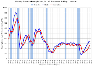
Multifamily Starts and completionsThe blue line is for multifamily starts and the red line is for multifamily completions.

The rolling 12 month total for starts (blue line) increased steadily over the last few years, and completions (red line) have lagged behind - but completions have been catching up (more deliveries), and will continue to follow starts up (completions lag starts by about 12 months).

Note that the blue line (multi-family starts) might be starting to move more sideways.

I think most of the growth in multi-family starts is probably behind us - although I expect solid multi-family starts for a few more years (based on demographics).

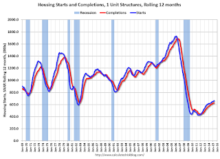
Single family Starts and completionsThe second graph shows single family starts and completions. It usually only takes about 6 months between starting a single family home and completion - so the lines are much closer. The blue line is for single family starts and the red line is for single family completions.

Note the exceptionally low level of single family starts and completions.  The "wide bottom" was what I was forecasting several years ago, and now I expect several years of increasing single family starts and completions.

A solid report.

Housing Starts increased to 1.135 Million Annual Rate in April, Highest since 2007

From the Census Bureau: Permits, Starts and Completions
Housing Starts:
Privately-owned housing starts in April were at a seasonally adjusted annual rate of 1,135,000. This is 20.2 percent above the revised March estimate of 944,000 and is 9.2 percent above the April 2014 rate of 1,039,000.

Single-family housing starts in April were at a rate of 733,000; this is 16.7 percent above the revised March figure of 628,000. The April rate for units in buildings with five units or more was 389,000.
emphasis added

Building Permits:
Privately-owned housing units authorized by building permits in April were at a seasonally adjusted annual rate of 1,143,000. This is 10.1 percent above the revised March rate of 1,038,000 and is 6.4 percent above the April 2014 estimate ...

Single-family authorizations in April were at a rate of 666,000; this is 3.7 percent above the revised March figure of 642,000. Authorizations of units in buildings with five units or more were at a rate of 444,000 in April.
Total Housing Starts and Single Family Housing Starts Click on graph for larger image.

The first graph shows single and multi-family housing starts for the last several years.

Multi-family starts (red, 2+ units) increased in April.  Multi-family starts are up 9.2% year-over-year.

Single-family starts (blue) increased in April and are up about 14.7% year-over-year.

The second graph shows total and single unit starts since 1968.

Total Housing Starts and Single Family Housing Starts The second graph shows the huge collapse following the housing bubble, and then - after moving sideways for a couple of years - housing is now recovering (but still historically low),

This was well above expectations of 1.029 million starts in April.  Overall this was a solid report with upward revisions to prior months. I'll have more later ...

Monday 18 May 2015

Tuesday: Housing Starts

From the SF Fed: The Puzzle of Weak First-Quarter GDP Growth
In late April, the Bureau of Economic Analysis (BEA) released its initial estimate of U.S. economic growth for the first three months of 2015. The report was very disappointing, as inflation-adjusted, or real, gross domestic product (GDP) edged up a mere 0.2% at an annual rate in the first quarter. This estimate was far weaker than many economists had forecast, and it raised concerns that the underlying economic recovery may have stalled. Such anemic growth is of particular concern to Federal Reserve policymakers considering when to begin normalizing monetary policy.

However, a number of analysts have suggested that the reported weakness in first-quarter growth may have been exaggerated by a statistical anomaly (see, for example, Liesman 2015 and Wolfers 2015). Indeed, an unusual pattern has prevailed for some time in which first-quarter real GDP growth is generally lower than growth later in the year. This regular, calendar-based statistical pattern is a puzzle because the BEA seasonally adjusts the GDP data to remove such fluctuations. First-quarter seasonally adjusted real GDP growth should not be consistently higher or lower than growth in any other quarter. Accordingly, the anomalous pattern of generally weak first-quarter growth suggests that the BEA’s estimate of GDP growth for the first three months of 2015 may understate the true strength of the economy.
...
The application of second-round seasonal adjustment increases real GDP growth in the first quarter of 2015 from its initial published value of 0.2% to 1.8%. Taking this correction at face value, real GDP growth in the first quarter was stronger and much closer to the economy’s sustainable rate of trend growth.
...
The very weak initial estimate of first-quarter real GDP growth this year surprised many forecasters, in part because it was at odds with other fairly positive data, including solid employment gains over the past six months. We show that, although the BEA adjusts for seasonal movements at a disaggregated level, the published real GDP data still exhibit calendar-based fluctuations—that is, residual seasonality. After we apply a second round of seasonal adjustment directly to the published aggregate data, we estimate much faster real GDP growth in the first quarter of this year. We conclude that there is a good chance that underlying economic growth so far this year was substantially stronger than reported.
Q1 will probably be revised down to a negative reading, but ... no worries!

Tuesday:
• At 8:30 AM ET, Housing Starts for April. Total housing starts increased to 926 thousand (SAAR) in March. Single family starts increased to 618 thousand SAAR in March. The consensus is for total housing starts to increase to 1.029 million (SAAR) in April.

LA area Port Traffic Decreased in April

Note: LA area ports were impacted by labor negotiations that were settled on February 21st. Port traffic surged in March as the waiting ships were unloaded (the trade deficit increased in March too), and port traffic declined in April.

Container traffic gives us an idea about the volume of goods being exported and imported - and usually some hints about the trade report since LA area ports handle about 40% of the nation's container port traffic.

The following graphs are for inbound and outbound traffic at the ports of Los Angeles and Long Beach in TEUs (TEUs: 20-foot equivalent units or 20-foot-long cargo container).

To remove the strong seasonal component for inbound traffic, the first graph shows the rolling 12 month average.

LA Area Port TrafficClick on graph for larger image.

On a rolling 12 month basis, inbound traffic was down 0.2% compared to the rolling 12 months ending in March.   Outbound traffic was down 1.1% compared to 12 months ending in March.

Inbound traffic had been increasing, and outbound traffic had been moving down recently.  The recent downturn in exports might be due to the strong dollar and weakness in China.

The 2nd graph is the monthly data (with a strong seasonal pattern for imports).

LA Area Port TrafficUsually imports peak in the July to October period as retailers import goods for the Christmas holiday, and then decline sharply and bottom in February or March (depending on the timing of the Chinese New Year).

Imports were down 2% year-over-year in April; exports were down 11% year-over-year.

The labor issues are now resolved - the ships have disappeared from the outer harbor - and the distortions from the labor issues are behind us.  This data suggests a smaller trade deficit in April.

Apartments: Supply and Demand

Time flies! It was five years ago that we started discussing the turnaround for apartments. Then, in January 2011, I attended the NMHC Apartment Strategies Conference in Palm Springs, and the atmosphere was very positive.  (Note: This is an update to a post I wrote a year ago).

The drivers were 1) very low new supply, and 2) strong demand (favorable demographics, and people moving from owning to renting).

Demographics are still favorable, but my sense is the move "from owning to renting" has slowed. And more supply has been coming online.

On demographics, a large cohort has been moving into the 20 to 34 year old age group (a key age group for renters). Also, in 2015, based on Census Bureau projections, the two largest 5 year cohorts are 20 to 24 years old, and 25 to 29 years old (the largest cohorts are no longer be the "boomers").  Note: Household formation would be a better measure than population, but reliable data for households is released with a long lag.

Population 20 to 34 years old Click on graph for larger image.

This graph shows the population in the 20 to 34 year age group has been increasing.  This is actual data from the Census Bureau for 1985 through 2010, and current projections from the Census Bureau from 2015 through 2035.

The circled area shows the recent and projected increase for this group.

From 2020 to 2030, the population for this key rental age group is expected to remain mostly unchanged.

This favorable demographic is a key reason I've been positive on the apartment sector for the last five years - and I expect new apartment construction to stay strong for a few more years.

And on supply, the table below shows the number of 5+ units started and completed per year since 1990 (Completions matter for supply).  New supply will probably increase by 250,000 to 260,000 units this year - and increase further in 2015 since it can take over a year from start to completion for large complexes.  Note: This doesn't include houses converted to rentals - and that is a substantial number in recent years.

This suggests new supply will probably balance demand soon, and that means vacancy rates have likely bottomed.

5+ Units, Starts and Completions (000s)1
YearCompletionsStarts
1990297.3260.4
1991216.6137.9
1992158.0139.0
1993127.1132.6
1994154.9223.5
1995212.4244.1
1996251.3270.8
1997247.1295.8
1998273.9302.9
1999299.3306.6
2000304.7299.1
2001281.0292.8
2002288.2307.9
2003260.8315.2
2004286.9303.0
2005258.0311.4
2006284.2292.8
2007253.0277.3
2008277.2266.0
2009259.897.3
2010146.5104.3
2011129.9167.3
2012157.6233.9
2013186.2293.7
2014255.6341.7
20152265.0350.0
1 5+ units is close to the number of units built for rent each year.
2 Pace through March 2015, completions will probably be above 270,000 for 2015

NAHB: Builder Confidence decreased to 54 in May

The National Association of Home Builders (NAHB) reported the housing market index (HMI) was at 54 in May, down from 56 in April. Any number above 50 indicates that more builders view sales conditions as good than poor.

From the NAHB: Builder Confidence Falls Two Points in May
Builder confidence in the market for newly built, single-family homes in May dropped two points to a level of 54 on the National Association of Home Builders/Wells Fargo Housing Market Index (HMI) released today. It is a nine-point increase from the May 2014 reading of 45.
...
“Consumers are exhibiting caution, and want to be on more stable financial footing before purchasing a home,” said NAHB Chief Economist David Crowe. “On the bright side, the HMI component measuring future sales expectations has been tracking upward all year, mortgage rates remain low, and house prices are affordable. These factors should spur the release of pent-up demand moving forward.”
...
The index’s components were mixed in May. The component charting sales expectations in the next six months rose one point to 64, the index measuring buyer traffic dropped a single point to 39, and the component gauging current sales conditions decreased two points to 59.

Looking at the three-month moving averages for regional HMI scores, the South and Midwest each rose one point to 57 and 55, respectively. The Northeast fell by one point to 41 and the West dropped three points to 55.
emphasis added
HMI and Starts Correlation Click on graph for larger image.

This graph show the NAHB index since Jan 1985.

This was below the consensus forecast of 57.

Sunday 17 May 2015

Sunday Night Futures

Monday:
• At 10:00 AM ET, the May NAHB homebuilder survey. The consensus is for a reading of 57, up from 56 last month. Any number above 50 indicates that more builders view sales conditions as good than poor.

Weekend:
Schedule for Week of May 17, 2015

From CNBC: Pre-Market Data and Bloomberg futures: currently S&P futures and DOW futures are mostly unchanged (fair value).

Oil prices were up over the last week with WTI futures at $59.79 per barrel and Brent at $66.90 per barrel.  A year ago, WTI was at $100, and Brent was at $108 - so, even with the recent increases, prices are down 40%+ year-over-year.

Below is a graph from Gasbuddy.com for nationwide gasoline prices. Nationally prices are up to $2.70 per gallon (down less than $1.00 per gallon from a year ago).

If you click on "show crude oil prices", the graph displays oil prices for WTI, not Brent; gasoline prices in most of the U.S. are impacted more by Brent prices.


Orange County Historical Gas Price Charts Provided by GasBuddy.com

Goldman's Hatzius: "The Employment Gap Is Much Bigger than the FOMC's Current Estimate"

Some excerpts from a research piece by Goldman Sachs chief economist Jan Hatzius: The Employment Gap Is Much Bigger than the FOMC's Current Estimate of the Unemployment Gap
The Fed's most "official" view of excess labor market slack is the gap between the unemployment rate (currently 5.4%) and the midpoint of the FOMC's central tendency range for the "longer-term" rate (currently 5.1%), which is usually taken to be an estimate of the structural unemployment rate. Taken at face value, this implies that the US economy can only create an additional 500,000 jobs before the labor market starts to overheat. ... If this is the right perspective, it would be entirely sensible, and perhaps urgent, to start normalizing monetary policy soon.

But we think it is a misleading perspective, for two reasons. First, the FOMC's current estimate of the structural unemployment rate is likely to continue falling ... This would not only be in keeping with the trend over the past two years, but also with a new study by the Chicago Fed which argues that population aging is likely to push structural unemployment significantly lower over time. ... If the Chicago Fed estimates are correct, the economy would be able to create about 800,000 jobs before the labor market starts to overheat in the short term, and as many as 1.4 million jobs in the longer term. This would already imply significantly less urgency to start normalizing monetary policy than the 500,000 jobs gap implied by the current FOMC estimate of the structural unemployment rate.

Second, there is probably significant labor market slack outside the unemployment gap because there is an important cyclical element in the decline of the labor force participation rate since 2007. This is consistent with Federal Reserve Research. For example, we can use updated estimates of the "demographically adjusted" employment/population ratio by Samuel Kapon and Joseph Tracy at the New York Fed to calculate another, broader version of the current jobs gap. Under the assumption that the labor market was at full employment in the third quarter of 2005--in line with the CBO estimate used in the Chicago Fed estimate above--the Kapon-Tracy numbers imply that the employment/population ratio is currently 1.2 percentage points below its equilibrium level. Multiplying this number by the over-16 population of about 250 million, the implied jobs gap is as large as 3 million. This implies much less urgency to start normalizing monetary policy than the unemployment-based numbers discussed above, and it is an important reason why we think it would be better for the FOMC to wait until 2016 before starting the normalization process.
CR Note: Here is the Chicago Fed Research Hatzius references: Changing labor force composition and the natural rate of unemployment. It is difficult to estimate the amount of slack in the labor market. However, because the risks are not symmetrical (normalizing monetary policy too soon is more risky than normalizing too late), this is an argument for waiting until there are signs of a pickup in wages and inflation.   However, as Yellen recently noted: "we need to keep in mind the well-established fact that the full effects of monetary policy are felt only after long lags. This means that policymakers cannot wait until they have achieved their objectives to begin adjusting policy."

Saturday 16 May 2015

An update on oil prices

Demand for gasoline has picked up significantly recently. In February, U.S. vehicle miles driven hit a new all time high.  Gasoline prices have increased too (although some of the increase was due to refinery problems).

From the LA Times: Four-dollar gasoline returns to the L.A. area
On Friday, the average for a gallon of regular in the Los Angeles area was higher than $4 for the first time since July, according to daily fuel price reports by AAA and GasBuddy.com. The recent surge in regional fuel prices has left local drivers paying more on average than motorists anywhere else in the U.S.

Analysts attributed the rise to a supply pinch caused by problems at the state's refineries, and predicted relief may not arrive in time for Memorial Day weekend road trips.
Oil PricesClick on graph for larger image

This graph shows WTI and Brent spot oil prices from the EIA. (Prices Friday added).  According to Bloomberg, WTI was at $59.69 per barrel on Friday, and Brent at $66.81

Prices have increased sharply off the recent bottom, but are still down 40%+ year-over-year.


Schedule for Week of May 17, 2015

The key economic reports this week are April Housing Starts on Tuesday and April Existing on Sales on Thursday.

For manufacturing, the April Philly and Kansas City Fed surveys will be released this week.

For prices, April CPI will be released on Friday.

Also on Friday, Fed Chair Janet Yellen will speak on the U.S. economic outlook.

----- Monday, May 18th -----

10:00 AM: The May NAHB homebuilder survey. The consensus is for a reading of 57, up from 56 last month.  Any number above 50 indicates that more builders view sales conditions as good than poor.

----- Tuesday, May 19th -----

Total Housing Starts and Single Family Housing Starts8:30 AM: Housing Starts for April.

Total housing starts increased to 926 thousand (SAAR) in March. Single family starts increased to 618 thousand SAAR in March.

The consensus is for total housing starts to increase to 1.029 million (SAAR) in April.

----- Wednesday, May 20th -----

7:00 AM: The Mortgage Bankers Association (MBA) will release the results for the mortgage purchase applications index.

During the day: The AIA's Architecture Billings Index for April (a leading indicator for commercial real estate).

2:00 PM: the Fed will release the FOMC Minutes for the Meeting of April 28-29, 2015.

----- Thursday, May 21st -----

8:30 AM: The initial weekly unemployment claims report will be released. The consensus is for claims to increase to 270 thousand from 264 thousand.

8:30 AM ET: Chicago Fed National Activity Index for April. This is a composite index of other data.

10:00 AM: the Philly Fed manufacturing survey for May. The consensus is for a reading of 8.0, up from 7.5 last month (above zero indicates expansion).

Existing Home Sales10:00 AM: Existing Home Sales for April from the National Association of Realtors (NAR).

The consensus is for sales of 5.22 million on seasonally adjusted annual rate (SAAR) basis. Sales in March were at a 5.19 million SAAR. Economist Tom Lawler estimates the NAR will report sales of 5.20 million SAAR.

A key will be the reported year-over-year change in inventory of homes for sale.

11:00 AM: the Kansas City Fed manufacturing survey for May.

1:30 PM: Speech by Fed Vice Chairman Stanley Fischer, Past, Present, and Future Challenges for the Euro Area, At the ECB Forum on Central Banking, Linho Sintra, Portugal

----- Friday, May 22nd -----

8:30 AM: The Consumer Price Index for April from the BLS. The consensus is for a 0.1% increase in prices, and a 0.1% increase in core CPI.

1:00 PM: Speech by Fed Chair Janet L. Yellen, U.S. Economic Outlook, At the Greater Providence Chamber of Commerce Economic Outlook Luncheon, Providence, Rhode Island

Friday 15 May 2015

Lawler: Preliminary Table of Distressed Sales and Cash buyers for Selected Cities in April

Economist Tom Lawler sent me the preliminary table below of short sales, foreclosures and cash buyers for a few selected cities in April.

On distressed: Total "distressed" share is down in most of these markets mostly due to a decline in short sales (Mid-Atlantic is up year-over-year because of an increase in foreclosures in Baltimore).

Short sales are down in these areas.

The All Cash Share (last two columns) is declining year-over-year. As investors pull back, the share of all cash buyers will probably continue to decline.

From Lawler: Note: The Baltimore Metro area is included in the overall Mid-Atlantic region (covered by MRIS). I am showing it separately because a large portion of the YOY increase in the foreclosure share of home sales in the Mid-Atlantic region was attributable to the almost 85% YOY increase in foreclosure sales in the Baltimore Metro area.

  Short Sales ShareForeclosure Sales Share Total "Distressed" ShareAll Cash Share
Apr-15Apr-14Apr-15Apr-14Apr-15Apr-14Apr-15Apr-14
Las Vegas7.2%12.4%8.3%11.4%15.5%23.8%30.4%41.4%
Reno**6.0%15.0%5.0%6.0%11.0%21.0%   
Phoenix2.5%4.0%3.8%6.5%6.3%10.5%25.3%32.2%
Minneapolis2.9%5.1%9.2%16.0%12.0%21.1%   
Mid-Atlantic4.5%5.9%12.9%10.0%17.3%15.9%17.2%19.5%
Baltimore Metro4.3%5.8%20.7%13.8%25.0%19.6%   
Orlando4.8%9.1%24.7%23.7%29.5%32.8%37.4%42.4%
Chicago (city)        20.3%27.3%   
Hampton Roads        22.2%24.4%   
Chicago (city)        20.3%27.3%   
Northeast Florida        28.9%38.0%   
Toledo            30.2%33.4%
Tucson            27.1%30.5%
Des Moines            13.8%17.1%
Peoria            17.3%21.2%
Georgia***            21.6%34.3%
Omaha            16.4%19.7%
Richmond VA MSA    11.5%15.4%    18.2%22.5%
Memphis    16.1%17.3%       
Springfield IL**    10.3%13.2%    17.9%N/A
*share of existing home sales, based on property records
**Single Family Only
***GAMLS

Hotels: On Pace for Record Occupancy in 2015

From HotelNewsNow.com: STR: US hotel results for week ending 9 May
The U.S. hotel industry recorded positive results in the three key performance measurements during the week of 3-9 May 2015, according to data from STR, Inc.

In year-over-year measurements, the industry’s occupancy increased 1.3 percent to 67.0 percent. Average daily rate increased 4.8 percent to finish the week at US$120.59. Revenue per available room for the week was up 6.1 percent to finish at US$80.85.
emphasis added
Note: ADR: Average Daily Rate, RevPAR: Revenue per Available Room.

The following graph shows the seasonal pattern for the hotel occupancy rate using the four week average.

Hotels are now in the Spring travel period and business travel is solid.

Hotel Occupancy Rate Click on graph for larger image.

The red line is for 2015, dashed orange is 2014, blue is the median, and black is for 2009 - the worst year since the Great Depression for hotels.  Purple is for 2000.

The 4-week average of the occupancy rate is solidly above the median for 2000-2007, and solidly above last year.

Right now 2015 is even above 2000 (best year for hotels) - and 2015 will probably be the best year on record for hotels.  Note the solid gains for RevPAR too.

Data Source: Smith Travel Research, Courtesy of HotelNewsNow.com